Point North: Expanding reach beyond County Durham
The County Durham Community Foundation (CDCF) is a grant-making organisation supporting communities in County Durham and the wider North East region struggling with poverty.
Established in 1995, the CDCF had a strong reputation but felt its visual brand and name didn’t fully reflect its current work and future aspirations.
The Challenge
The County Durham Community Foundation faced a three-pronged challenge.
The success of its ‘Poverty Hurts’ campaign was confused by overshadowing the CDCF's own brand identity. Additionally, the CDCF’s visual identity felt outdated and needed a refresh to connect with modern audiences. Its growth strategy also demanded a brand that could attract new donors and extend its reach beyond County Durham.
Our Approach
Cool Blue took a multi-layered approach to revitalise the County Durham Community Foundation’s brand. To gain a deep understanding of the existing brand landscape, we conducted a thorough brand audit. This involved evaluating the CDCF’s current visual identity, any sub-brands like ‘Poverty Hurts’ and the overall messaging used to communicate with its audience.
Next, we recognised the importance of stakeholder engagement and facilitated discussions with key groups like donors, grantees who receive funding and the CDCF’s board. This ensured the new brand would resonate with all parties involved.
In parallel with stakeholder engagement, we explored the possibility of a name change. We considered this alongside the future of the ‘Poverty Hurts’ campaign, aiming to create a cohesive brand identity.
To further refine its strategy, we defined the CDCF’s core audience segments, such as potential donors or community groups seeking grants. Understanding these audiences’ needs and preferences allowed us to tailor the messaging and brand image accordingly.
With a clear understanding of the CDCF’s goals and target audience, Cool Blue developed a new brand positioning and crafted concise messaging statements. Those which would become the core foundation for all future communication from Point North.

The Outcome
The rebrand of the County Durham Community Foundation produced a series of positive outcomes. Firstly, the organisation adopted a new name – Point North. This change reflected its broader geographical focus, encompassing more than just County Durham. Additionally, ‘Point North’ conveyed a future-oriented approach, signifying their commitment to long-term impact.
Cool Blue designed a fresh look for Point North. This included a new logo, a selection of fonts and a modern colour scheme. The new visuals presented Point North with a professional and contemporary image, better suited to attract new audiences and donors.
Furthermore, the rebrand addressed the confusion surrounding the ‘Poverty Hurts’ campaign. Cool Blue transitioned the campaign into the ‘Change Today’ fund. While the focus on tackling immediate needs remained, ‘Change Today’ better aligned with the overall messaging under the Point North brand.
To ensure consistent communication across all platforms, Cool Blue developed a comprehensive brand guideline document. This document served as a roadmap, outlining the accurate usage of Point North's new visual identity and messaging.
Finally, the rebrand extended to Point North’s digital presence. Its website and all communication materials received an update, ensuring a cohesive brand experience across all touchpoints.
Take a look HERE

Overall Success
The Point North rebrand has been well-received by stakeholders. The new name and visual identity better represent the organisation’s mission and vision. Point North is now positioned for future growth, attracting new donors and expanding its reach to support more communities in the fight against poverty.
Cool Blue’s strategic approach and creative expertise helped Point North achieve a successful rebrand. By understanding the organisation’s goals and challenges, we developed a brand that is clear, impactful and future proof.
Michelle Cooper, chief executive at Point North, said: “Cool Blue’s work on the Point North rebrand has been instrumental in propelling our organisation into a new era of growth and impact. Their deep understanding of our mission and target audience, coupled with their creative expertise, has resulted in a brand identity that truly resonates with our stakeholders.
“The fresh, modern look and feel, combined with the strategic development of our new name, Point North, has enabled us to expand our reach beyond County Durham and make a greater difference in the lives of those facing poverty.”


“Cool Blue’s work on the County Durham Community Foundation rebrand has been instrumental in propelling our organisation into a new era of growth and impact. Their deep understanding of our mission and target audience and their creative expertise have resulted in a brand identity that truly resonates with our communities, stakeholders and our team!
“The fresh, modern look and feel, combined with the strategic development of our new name, Point North, better reflects the scope of our work as a charity and grantmaking organisation in County Durham, the Tees Valley and the wider North East. The clarity this work has given us will allow us to make a difference in the lives of people across our region by reaching more donors and supporters who want to join us in our mission to fight poverty and enrich lives.”
Michelle Cooper, Chief Executive, Point North
Selected Works

Steel River QuayProject type

Middlesbrough College: TTE Centre Official OpeningA milestone moment for technical education in Teesside

GB BankBuilding the Profile of a Leading Property Finance Provider
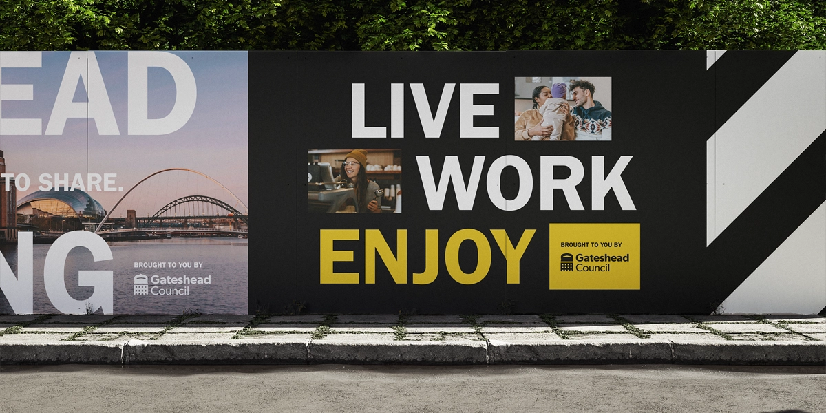
Gateshead RegenerationProject type
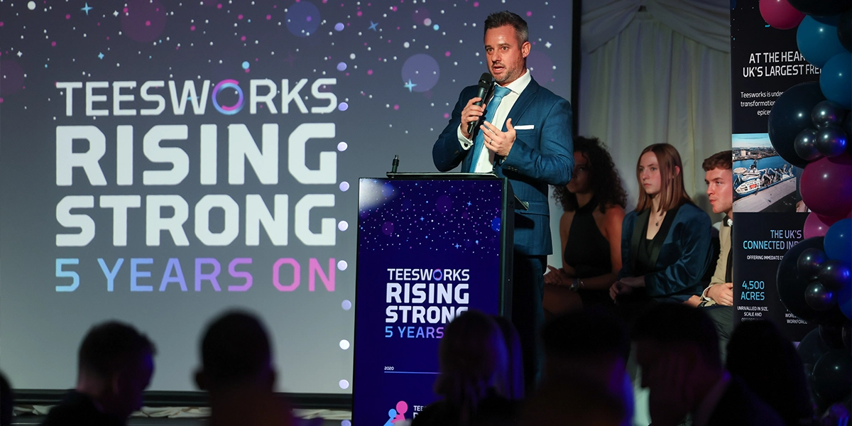
Teesworks: Rising Strong, 5 Years OnProject type

Middleton GrangeStrengthening Community and Digital Presence

Point NorthExpanding reach beyond County Durham

Northumberland County CouncilNorthumberland Line: From Abandoned Tracks to Brand Victory

TeesworksThe UK’s largest Freeport

The North East Ambulance Service:Make a Life-Saving Difference.

Harrogate Spring WaterMindful Drinking takes centre stage at Festive Influencer event.

Barker and Stonehouse: Gateshead Store LaunchUnveiling the new £5m store in Gateshead.
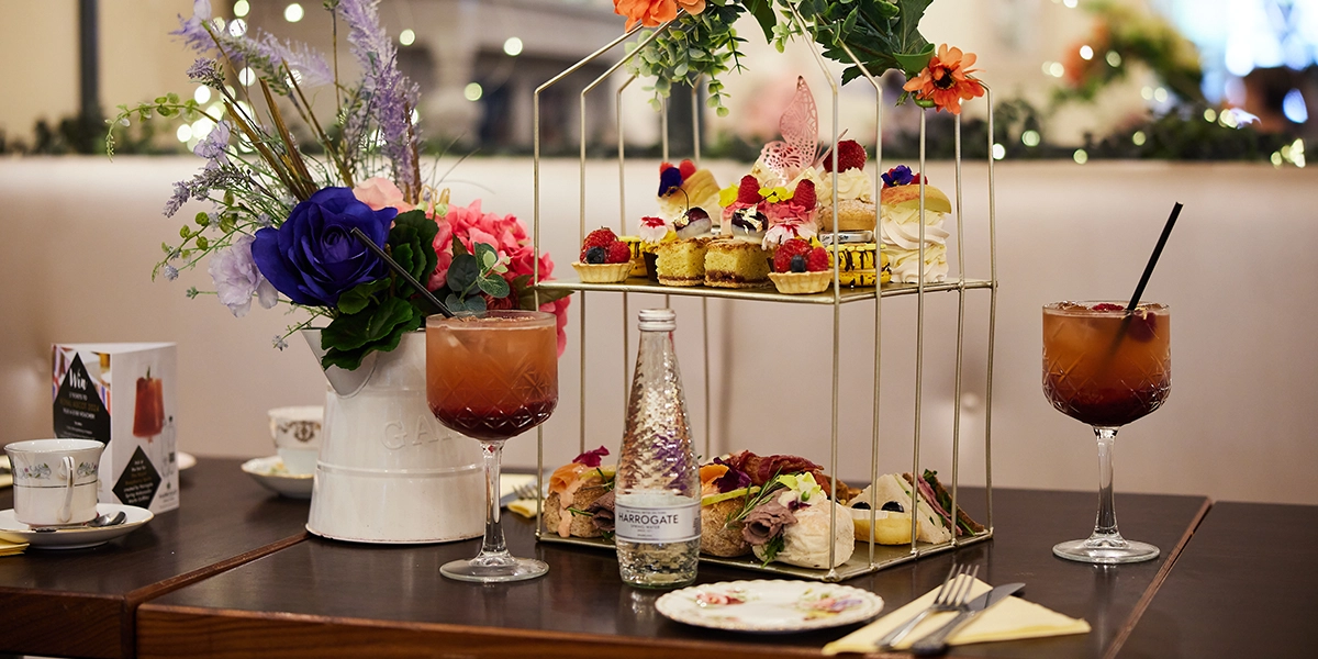
Harrogate Spring Water - Mindful DrinkingBringing a taste of Royal Ascot to North Yorkshire.

The City Baths Newcastle X John LewisBringing a brand partnership to this historic leisure destination.

Barker and Stonehouse: A Story of SustainabilityA sustainable approach to furniture retail.
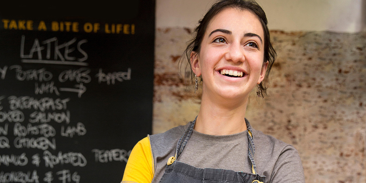
Grainger MarketEnhancing Newcastle’s Bustling Grade I Traders’ Market.

Anglo American:Powering cyber security.

Teesside UniversityCelebrating the Tees Valley digital community.

ProtiumStakeholder communications and engagement strategy.
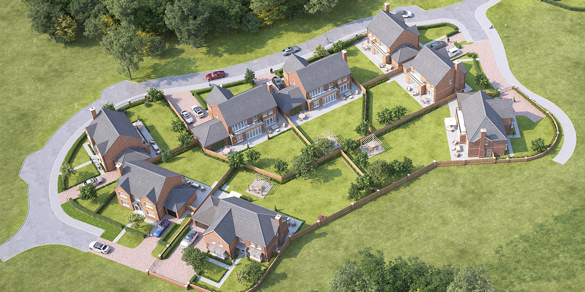
Banks HomesCreating a unique brand identity for the new-to-market luxury housebuilder.

North P&I:160 years of incredible maritime history.

Middlesbrough College:Finding brand purpose for a dynamic educator.

Sleepeezee:Everything's easy when you Sleepeezee.

North East England Chamber of CommerceGiving businesses their say in skills provision.

Ercol:A moment of pride in ercol’s history.

Newcastle Helix:Our City’s Drive Towards Net Zero.

Story Homes:A new chapter for this thriving residential developer.

Stephenson WorksA welcoming and generous spirit.

NewcastleGateshead Quays:A quay moment for NewcastleGateshead.

TeesAMP:Making it in Middlesbrough.

NewcastleGateshead Convention Bureau:Tyne to get back to business.

Tees Valley Combined Authority:Encouraging staycations in Tees Valley.

Siglion:Bringing some vitamin sea to Seaburn.

North East Ambulance Service:A global pandemic.

Thirteen Homes:How do you want to live?

herdysleep:A first of its kind for the bed-in-a-box market.

Libra Interiors:Connecting consumers in a new way.

Tees Valley Combined Authority:Tees Valley Mayoral Election Campaign.

Imagine. Create. EGGER:Launch of a new product range for this global manufacturer

Finchale Group:A dynamic rebrand for the leading employment charity.

Duresta:A brave and bohemian collaboration.

South Tyneside Council:Recognising local community heroes.

Fusion:Healthy in the Heart of the City.

UK Land EstatesBuildings for Business.

Merit HoldingsA world leading engineering company.

Harrogate Spring Water:Continuing to make a difference.

Barker and Stonehouse:Say hello to Mr Clarke.
Cool Blue is a full-service agency that drives brands forwards. Our ideas and innovations are always conducted with purpose. Delivering solutions that combat specific challenges and provide results. Our strategic expertise offer a valuable service to every one of our clients, helping them achieve their goals.
London
Soho Works, 2nd Floor
180 Strand
Temple
London
WC2R 1EA
T: 0203 535 0222
MAP
www.coolblue-interiors.co.uk