
Rebrands that got it right (and some that nearly didn’t!)
A brand’s identity is more than a logo or a colour palette – it’s a promise, a feeling and a statement about where it’s headed.
In recent years, some of the world’s most recognisable brands have stepped up to refresh their identities, often sparking passionate debate in the process.
As someone who spends a fair share of their day immersed in brand worlds, I wanted to take a look at some of the boldest, smartest and riskiest rebrands of recent times.
Here’s a few standouts:
Jaguar: A leap into the unknown
Jaguar’s rebrand is one of the most talked-about transformations in the automotive world – and for good reason. The British icon has traded its classic leaping cat emblem and heritage-laden cues for a stripped-back, minimalist identity that signals an all-electric future.
It’s a bold move. The new look is undeniably sleek, aligned with the understated, futuristic aesthetic dominating the EV space. But therein lies the risk. In shedding some of its old-world elegance, Jaguar may be treading dangerously close to becoming just another premium EV badge in a crowded field.
From a creative perspective, it’s an impressive exercise in restraint and clarity – but whether it captures hearts in the same way as its predecessor remains to be seen. It’s a modernisation play that was perhaps inevitable, but one that walks a tightrope between relevance and nostalgia.
In response to the backlash, Jaguar is reportedly seeking a new advertising agency to better align its marketing strategies with its brand vision.

Lloyds Bank: Balancing legacy with progress
Few brands carry the weight of history quite like Lloyds Bank. With over 250 years under its belt, the pressure to modernise without losing what makes it instantly recognisable is immense.
Thankfully, Lloyds pulled it off. Retaining its iconic black horse, the bank introduced a forward-facing design paired with refined typography and a revitalised green palette. The real magic, though, lies in the motion design system – subtle nods to equine movement that bring the brand to life across digital platforms.
The accompanying ‘The Power to Do It All’ campaign cleverly positions Lloyds as a contemporary, experience-led financial brand without abandoning its roots. It’s a textbook example of how to evolve heritage brands for the digital age: respectfully, but confidently.

Korean Air: Tradition meets modern luxury
Korean Air’s refresh is a perfect case study in balancing national heritage with global ambition. The airline’s simplified taeguk symbol and contemporary typography mark a clear step into the premium international space.

The new look is elegant and refined, retaining the spirit of the original while embracing a more modern, digital-friendly aesthetic. It’s the kind of rebrand that might not make headlines for controversy, but it wins quietly by doing exactly what it needs to: making the brand feel relevant, aspirational and distinctly premium.
It also demonstrates how smart design choices can subtly reposition a brand without losing its soul – something many brands could learn from.

Parkinson’s UK: A rebrand with real heart
Not all rebrands are about market share and digital assets. Parkinson’s UK’s recent rebrand is a masterclass in purpose-driven design. Developed in collaboration with over 1,000 people affected by the condition, the new identity places the community at its core.
The tulip symbol – inspired by the Parkinson’s tulip named after Dr James Parkinson – is a beautiful touch, supported by a bespoke, accessible typeface aptly named Parkinsans. Vibrant, hopeful colours replace the charity’s formerly clinical palette, reflecting energy and optimism.
What’s most striking here is how the rebrand manages to feel both deeply personal and universally approachable. It’s proof that when brands truly listen to their audiences, they create something far more meaningful than a visual overhaul – they create a sense of belonging.

Rebrands are never just about a new logo or colour palette. At their best, they’re a reflection of a brand’s future ambitions and a statement of intent to its audience. What unites these four very different brands is the bravery to evolve – whether by embracing technology, reaffirming purpose or carefully balancing heritage with modernity.
In a landscape where change is constant, the biggest risk is standing still.
Want to talk brand evolution? At Cool Blue, we help brands navigate transformation with strategy, creativity and heart.
Get in touch
We’d love to chat!
Selected Works

Middlesbrough College: TTE Centre Official OpeningA milestone moment for technical education in Teesside
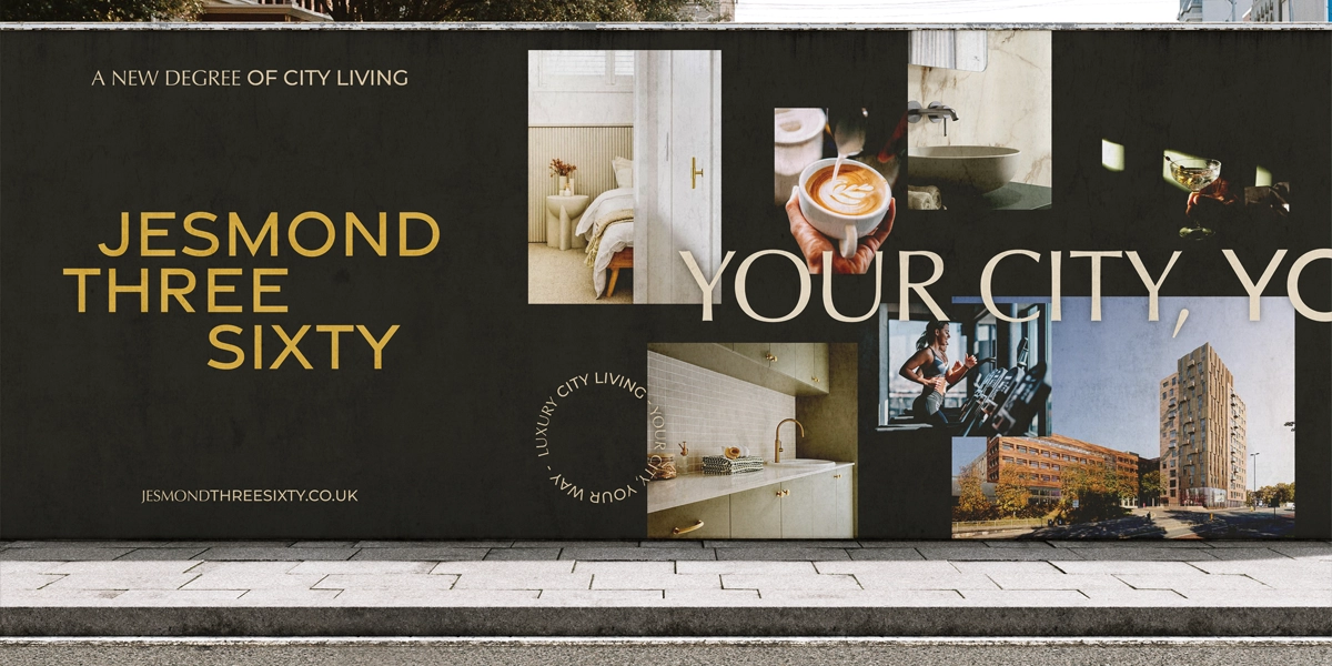
Jomast - Jesmond Three SixtyTurning a Development into a Destination

GB BankBuilding the Profile of a Leading Property Finance Provider
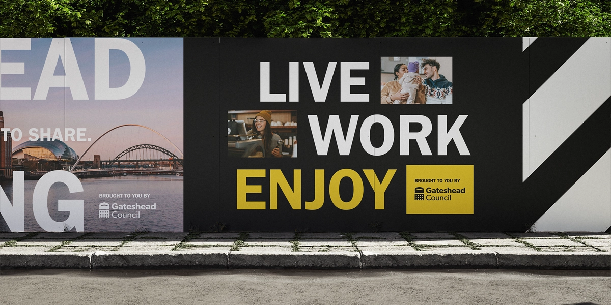
Gateshead RegenerationCreating a Cohesive Brand for Long-Term Transformation

Barker and Stonehouse: Gateshead Store LaunchUnveiling the new £5m store in Gateshead.

Middleton GrangeStrengthening Community and Digital Presence

The North East Ambulance Service:Make a Life-Saving Difference.
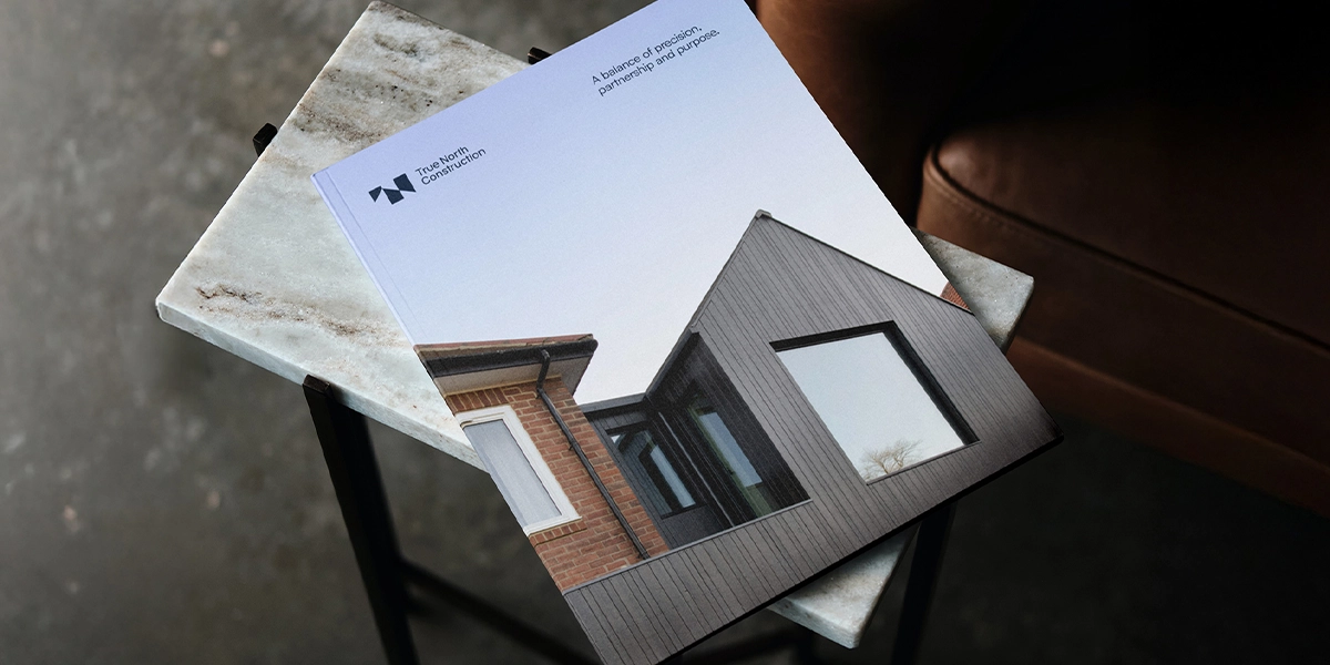
True North ConstructionA Distinctive Brand for a High-Performance Builder.
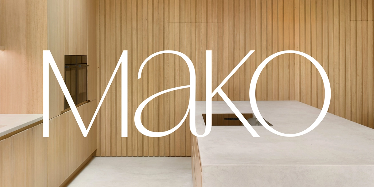
Mako BespokeFrom Quiet Craft To a Confident Brand Presence

Steel River QuayCharting a New Course
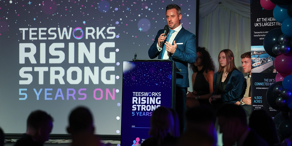
Teesworks: Rising Strong, 5 Years OnRising Strong, 5 Years On

Point NorthExpanding reach beyond County Durham

Northumberland County CouncilNorthumberland Line: From Abandoned Tracks to Brand Victory

TeesworksThe UK’s largest Freeport

Harrogate Spring WaterMindful Drinking takes centre stage at Festive Influencer event.

The City Baths Newcastle X John LewisBringing a brand partnership to this historic leisure destination.

Barker and Stonehouse: A Story of SustainabilityA sustainable approach to furniture retail.
Grainger MarketEnhancing Newcastle’s Bustling Grade I Traders’ Market.

Anglo American:Powering cyber security.

Teesside UniversityCelebrating the Tees Valley digital community.

ProtiumStakeholder communications and engagement strategy.
Banks HomesCreating a unique brand identity for the new-to-market luxury housebuilder.

North P&I:160 years of incredible maritime history.

Middlesbrough College:Finding brand purpose for a dynamic educator.

Sleepeezee:Everything's easy when you Sleepeezee.

North East England Chamber of CommerceGiving businesses their say in skills provision.

Ercol:A moment of pride in ercol’s history.

Newcastle Helix:Our City’s Drive Towards Net Zero.

Story Homes:A new chapter for this thriving residential developer.

Stephenson WorksA welcoming and generous spirit.

NewcastleGateshead Quays:A quay moment for NewcastleGateshead.

TeesAMP:Making it in Middlesbrough.

NewcastleGateshead Convention Bureau:Tyne to get back to business.

Tees Valley Combined Authority:Encouraging staycations in Tees Valley.

Siglion:Bringing some vitamin sea to Seaburn.

Thirteen Homes:How do you want to live?

herdysleep:A first of its kind for the bed-in-a-box market.

Libra Interiors:Connecting consumers in a new way.

Tees Valley Combined Authority:Tees Valley Mayoral Election Campaign.

Imagine. Create. EGGER:Launch of a new product range for this global manufacturer
Finchale Group:A dynamic rebrand for the leading employment charity.

Duresta:A brave and bohemian collaboration.

South Tyneside Council:Recognising local community heroes.

Fusion:Healthy in the Heart of the City.

UK Land EstatesBuildings for Business.

Merit HoldingsA world leading engineering company.

Harrogate Spring Water:Continuing to make a difference.

Barker and Stonehouse:Say hello to Mr Clarke.