
Why rebrand?
Companies – particularly successful ones – spend a lot of time and money on creating their brand, getting the look, feel, narrative and messaging exactly right and then communicating all that collateral through myriad channels.
Not got time to read the full article? Download our PDF report here.
—–
So after taking all that trouble on making your brand just so, why rip it up and start again?
If it ain’t broke, don’t fix it, right?
Well, no. Certainly not all the time.
There are a whole host of reasons why a rebrand is not only desirable for your business, but in some cases essential.
Here we take you through some of those reasons – and some examples of how it can be done.

The world has changed
Things move fast, particularly these days.
Consumers now are facing a whole list of different challenges which they were not facing even a couple of years ago: rapidly rising inflation, the cost of living crisis,
a continued squeeze on household budgets.
It’s a similarly challenging picture for businesses: rising input costs, recruitment and retention issues, the skills gap and, for companies in the UK, dealing with the reality of international trade in a post-Brexit world.
With all of this change, a brand and messaging that worked well a few years ago may now be out of sync with your customers’ priorities, not to mention the needs of those whose custom you are looking to attract.
That’s why now represents an ideal opportunity to look closely at your brand, your visual identity, your messaging and your communications to ensure that they still resonate with your audiences.
It may not need much to bring your brand more into line with current concerns, but it is certainly worth the time to check things out.
Your business has changed
As we all know, change is the only constant in business and failure to adapt to changing tastes, trends, technology or markets can spell potentially terminal trouble to a company.
So what happens when you change the focus of your company and serve a different market or operate in a completely different sector? Shouldn’t your brand change to reflect that shift?
Let’s take the example of Blue Ribbon Sports.
Who?

In 1964 Blue Ribbon Sports was founded as a distributor of running shoes. It did this pretty successfully, so successfully in fact that the founders decided that instead of selling other people’s shoes, they’d start making and selling their own.
The only thing was, ‘Blue Ribbon Sports Shoes’ didn’t really sound that great so they had to make a change.
In 1972 they named their running shoes Nike after the Greek goddess of victory. In 1978 they renamed the company Nike and went on to become the world’s most recognised sports brand with annual revenue of $46.7bn in the year to February 2023.
Would all that have happened to ‘Blue Ribbon Sports’? Probably not.

Your customers have changed
If the business world changes, then people change even faster.
The inescapable fact of ageing means that your customers will either get older or, in the case of certain goods and services, you’ll have to find new customers to replace your previous ones.
This means that whatever happens, your customer base is in a constant state of flux, changing not just their ages or appearances but also their priorities, their spending patterns and often their attitudes and outlook.
Retaining your current customers and attracting new ones can be much harder if they see that your business hasn’t moved on in the same way that they have.
That’s why many companies build in rebrands at regular intervals during their journey – to remain up to date but without looking like they’re chasing a trend.
It doesn’t have to be – and in some cases it shouldn’t be – a wholesale revamp with a name change, fancy new logo and raft of new messaging. Some of the most successful rebrands are those where you hardly notice the difference.
Let’s take an iconic British brand as an example: the BBC.
Everyone in the country feels like they have a stake in the BBC so any change to its brand risks upsetting millions.
However, over the years, the BBC logo and the way it is used has changed radically with alterations in the colouring, font and accompanying visuals to reflect how the corporation has gone from just radio and TV to incorporate websites, podcasts, streaming and various other digital media.
There is no way that persisting with the 1958 version of the logo would have been suitable in 2023 but via a series of incremental changes, the BBC has stayed with its audience and remained relevant to generations who were not born when it first came into being.

You have changed
Just like people, companies change during the course of their lives.
They can get smaller by selling off different divisions.
They can get larger by buying up other companies.
They can shift by merging with another business.
And they can change their attitude, purpose and outlook as the people within the business change.
If so much is different about your company as time goes by, shouldn’t your brand change as well?

Nokia is a company which has been through more changes than most businesses and in a relatively short space of time.
From being the mobile phone of choice around the millennium to near total wipeout by the iPhone and Android, it has experienced huge highs and lows.
These days, Nokia is focused on networks and industrial digitalization so it wanted to reflect that in its branding
as well as to underscore the fact that it was up to speed with what is new and wasn’t a legacy brand of the dotcom boom years.
As a result, last year Nokia changed its logo.
You can see the differences in things like of the use of sharp, edgy uppercase lettering, missing bars of the “N,” “K,” and “A” and the clean lines throughout.
The accompanying messaging has also changed. Nokia’s slogan used to be ‘Connecting People’ whereas now it is ‘Discover the power of n’, a deliberately mysterious, even slightly geeky line that reflects its status as a business-to-business brand which gets under the skin of technology.

Your competitors have changed
When you first started out in business, your company was the new kid on the block, the disruptor, the coming force.
Yet as time has passed, other new entrants have come into the sector with new ideas, new products – and new looks.
What was once cutting edge, dramatic and new is now run of the mill or, even worse, looking rather dated.
In a situation like this, a rebrand or a refresh of your current brand is a great way to tell the world that you’re still very much moving forward and, while you haven’t forgotten your roots, you are still relevant to the concerns and needs of your customers.
Nothing sharpens you up like a new outfit, so why not try one on for size?
Of course, when you have a brand which is valuable, recognisable and well-known, rebranding is something which requires very careful handling.
In the case of the most valuable brands, researching potential reactions from your audience is often a good idea before plunging into the revamp.
That’s why global brands tend to do things incrementally when it comes to rebranding.
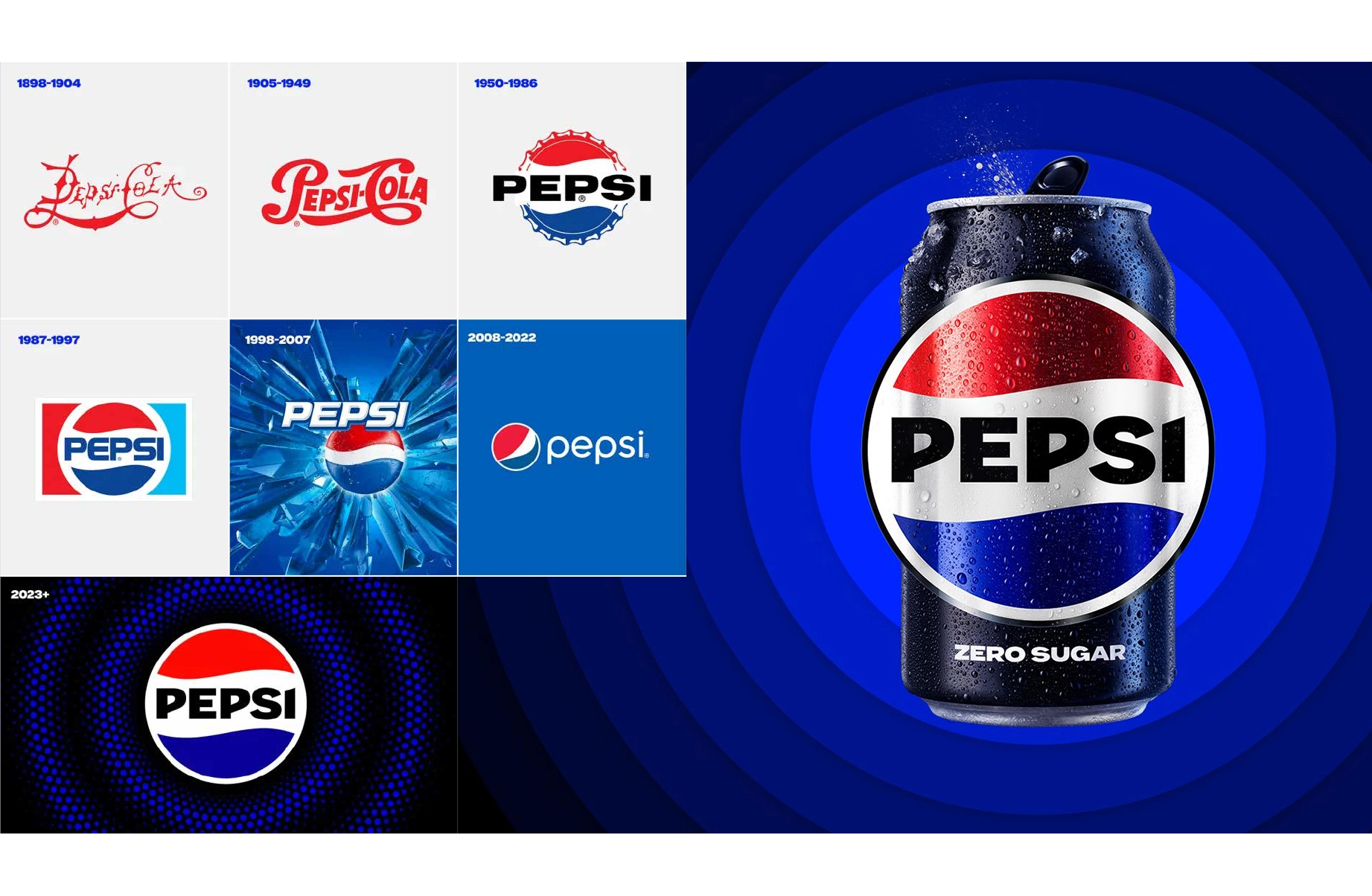
Let’s take Pepsi as an example.
It started off as an up-and-coming disruptor to the dominance of Coca-Cola but after more than 100 years in business, it can’t be like that forever.
So when it embarked on a rebrand this year, Pepsi did so with great care.
This new logo is the first time the company has rebranded in 14 years. The goal of the redesign, according to PepsiCo’s chief design officer Mauro Porcini, is to create a visual identity that connects with future generations while honouring the brand’s heritage.
So what’s different? Take a look and you’ll see:
- The Pepsi globe and wordmark unite to fit into a variety of settings and emphasise the distinctive Pepsi branding
- An updated colour palette introduces electric blue and black to bring contrast, vibrancy, and a contemporary edge to the Pepsi colour scheme. With Pepsi keen to promote Pepsi Zero Sugar, the design brings in the colour black, its keynote colour in Pepsi Zero Sugar’s design palette
- A modern, custom typeface which moves away from the former lower case font and, say Pepsi, reflects its “confidence” and “unapologetic mindset”
Pepsi will start to roll the new brand out in its North America heartland this autumn, followed by a global rollout in 2024.
Where does a rebrand fit in for me?
You may be looking through these examples and thinking ‘that’s all well and good for multinational consumer brands, but what about me?
We hear you.
But trust us, you don’t need to be a household name or have a budget in the millions to embark on a successful rebrand.
At Cool Blue, we’ve helped lots of companies of all sizes on their rebranding, from providing expert analysis of their current assets through to creating a full rebrand with new logos, supporting messages and refreshed communications.
We’ll give you great ideas, a new way of looking at things and a refreshingly no-nonsense, straightforward approach to getting the job done.
As an example, see how we made a difference for Merit Holdings when they approached us to help with their rebrand. https://www.coolblue.co.uk/project/merit-holdings
To start your rebrand journey or to just have a chat about where you are at the moment, please drop us a line or give us a call.

Selected Works

Steel River QuayProject type

Middlesbrough College: TTE Centre Official OpeningA milestone moment for technical education in Teesside

GB BankBuilding the Profile of a Leading Property Finance Provider
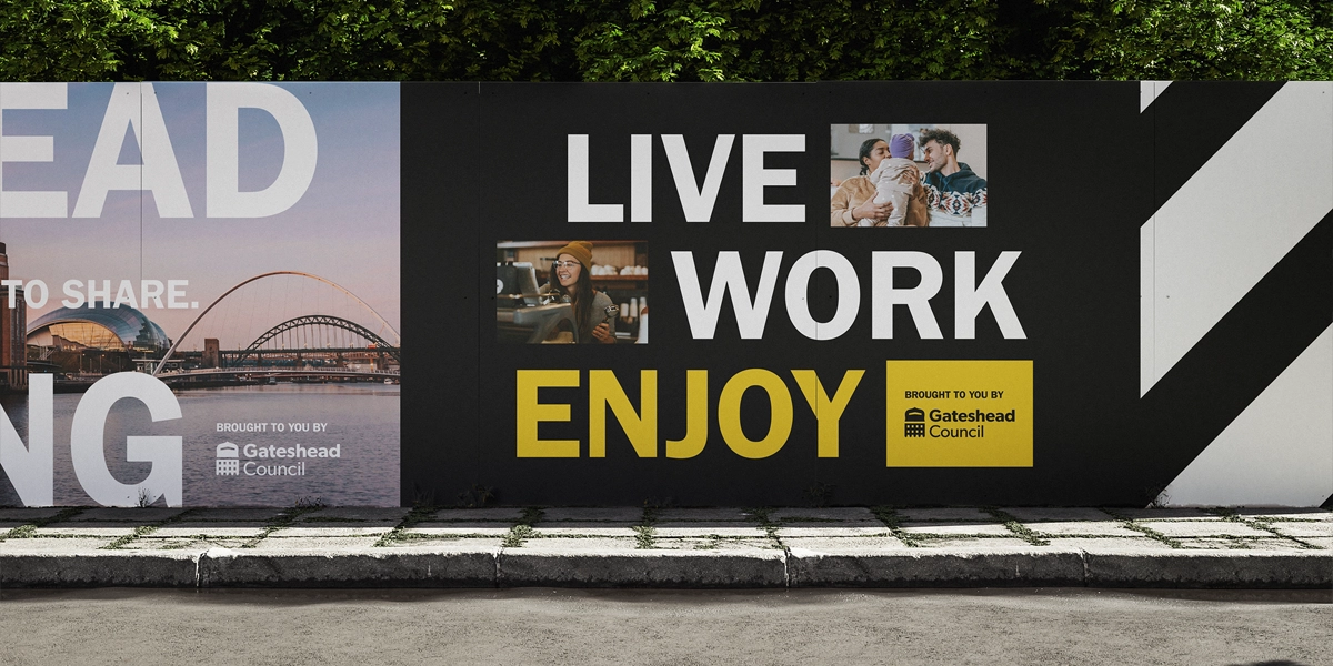
Gateshead RegenerationProject type
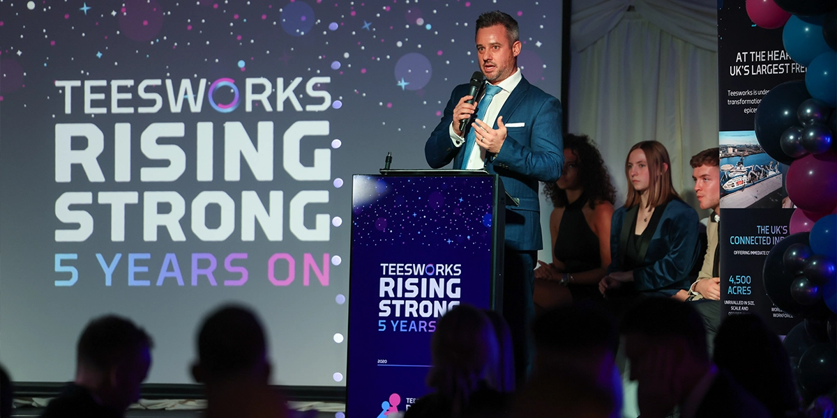
Teesworks: Rising Strong, 5 Years OnProject type

Middleton GrangeStrengthening Community and Digital Presence

Point NorthExpanding reach beyond County Durham

Northumberland County CouncilNorthumberland Line: From Abandoned Tracks to Brand Victory

TeesworksThe UK’s largest Freeport

The North East Ambulance Service:Make a Life-Saving Difference.

Harrogate Spring WaterMindful Drinking takes centre stage at Festive Influencer event.

Barker and Stonehouse: Gateshead Store LaunchUnveiling the new £5m store in Gateshead.
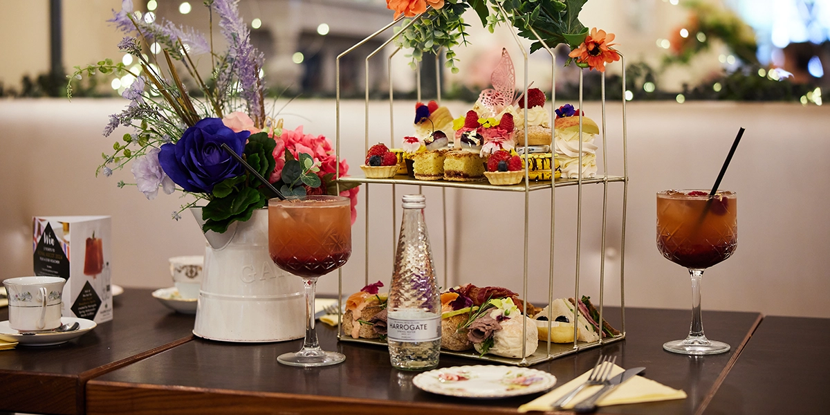
Harrogate Spring Water - Mindful DrinkingBringing a taste of Royal Ascot to North Yorkshire.

The City Baths Newcastle X John LewisBringing a brand partnership to this historic leisure destination.

Barker and Stonehouse: A Story of SustainabilityA sustainable approach to furniture retail.
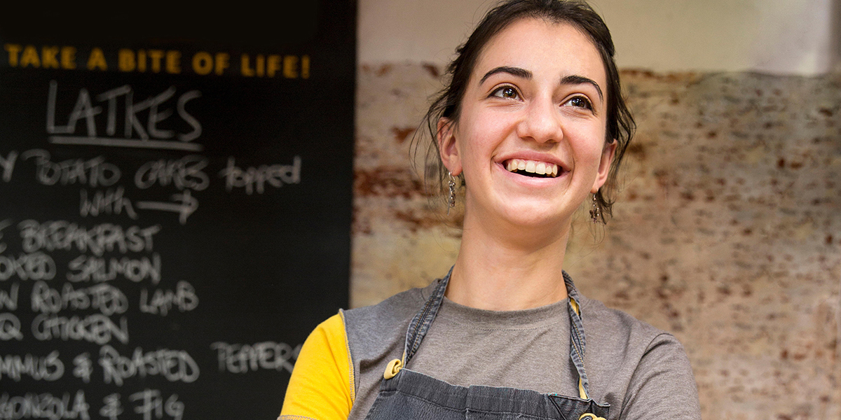
Grainger MarketEnhancing Newcastle’s Bustling Grade I Traders’ Market.

Anglo American:Powering cyber security.

Teesside UniversityCelebrating the Tees Valley digital community.

ProtiumStakeholder communications and engagement strategy.

Banks HomesCreating a unique brand identity for the new-to-market luxury housebuilder.

North P&I:160 years of incredible maritime history.

Middlesbrough College:Finding brand purpose for a dynamic educator.

Sleepeezee:Everything's easy when you Sleepeezee.

North East England Chamber of CommerceGiving businesses their say in skills provision.

Ercol:A moment of pride in ercol’s history.

Newcastle Helix:Our City’s Drive Towards Net Zero.

Story Homes:A new chapter for this thriving residential developer.

Stephenson WorksA welcoming and generous spirit.

NewcastleGateshead Quays:A quay moment for NewcastleGateshead.

TeesAMP:Making it in Middlesbrough.

NewcastleGateshead Convention Bureau:Tyne to get back to business.

Tees Valley Combined Authority:Encouraging staycations in Tees Valley.

Siglion:Bringing some vitamin sea to Seaburn.

North East Ambulance Service:A global pandemic.

Thirteen Homes:How do you want to live?

herdysleep:A first of its kind for the bed-in-a-box market.

Libra Interiors:Connecting consumers in a new way.

Tees Valley Combined Authority:Tees Valley Mayoral Election Campaign.

Imagine. Create. EGGER:Launch of a new product range for this global manufacturer

Finchale Group:A dynamic rebrand for the leading employment charity.

Duresta:A brave and bohemian collaboration.

South Tyneside Council:Recognising local community heroes.

Fusion:Healthy in the Heart of the City.

UK Land EstatesBuildings for Business.

Merit HoldingsA world leading engineering company.

Harrogate Spring Water:Continuing to make a difference.

Barker and Stonehouse:Say hello to Mr Clarke.
